
Who's the clearest of them all?
The Awards celebrated 10 years in 2015. The time seemed right for a fresh new look.
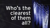
Craig Christensen of Graphic Solutions was keen to help. Craig is a great advocate of clear communication in words and visuals. And he designed the popular theme ‘Who’s the clearest of them all?’ for some of our earlier Awards.
‘Who’s the clearest of them all?’ successfully captured the essence of what the Awards are about. ‘We thought it was time to bring that theme back, but with a new twist’, says Craig. So now those words sit in a speech bubble against a background of editing symbols. The idea is to convey the idea of working hard to create the best and most effective communication.
The gold Awards icon is a simple graphic representation of a sentence. It was inspired by the emergence of icon-based visual language in digital media. The best known of these icons is the ‘hamburger menu’ icon, widely used on mobile websites to show where the navigation menu is kept.
Using gold for the icon signifies the prestige associated with the Awards and helps to bridge the gap between the old and new brands. Adding a deep electric blue to the colour palette adds vibrancy while complementing the gold of the original brand.
We’ve used some good old Kiwi phrases as language-based, companion imagery on the website, conveying the idea of fun Kiwi straightforwardness.
A new era for the Plain English Awards
This bold new identity represents the refreshed face of the Plain English Awards. We hope it’s going to become a very visible and recognisable brand and that it will help to further raise awareness of plain English in New Zealand.
Thanks to The Wright Family Foundation for kindly sponsoring the new website.
Sponsors
Thanks to all our amazing sponsors! We truly couldn’t do this without you.
© WriteMark Plain English Awards Trust. All rights reserved. 2024